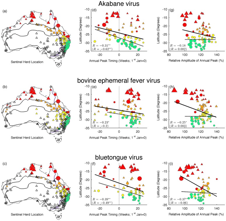
Figure 3. Seasonal parameters as a function of latitude are shown for Akabane virus (top), bovine ephemeral fever virus (middle), and bluetongue virus (bottom).
Left panel (a, b, c): estimated mean annual peak timing. Centre panel (d, e, f): estimated amplitude of annual peak, relative to the mean standardized time series. Right panel (g, h, i): map of Australia showing location of sentinel herds. Colors correspond to different climate regions (tropical: red; grasslands: orange; arid: yellow; warm-temperate: green) and shapes correspond to east (circles) and west (triangles) of the Great Dividing Range. Shape size corresponds to the mean number of seroconversions. Open shapes represent sentinel herds for which there has been no detection of these viruses. A black, solid line illustrates a line of best fit through all points while a dashed line shows the best fit through circles only (i.e. east of the Great Dividing Range). Pearson's R is shown (in parentheses for circles only), and an asterisk indicates whether it is significantly different from zero (*p<0.05; **p<0.01).

