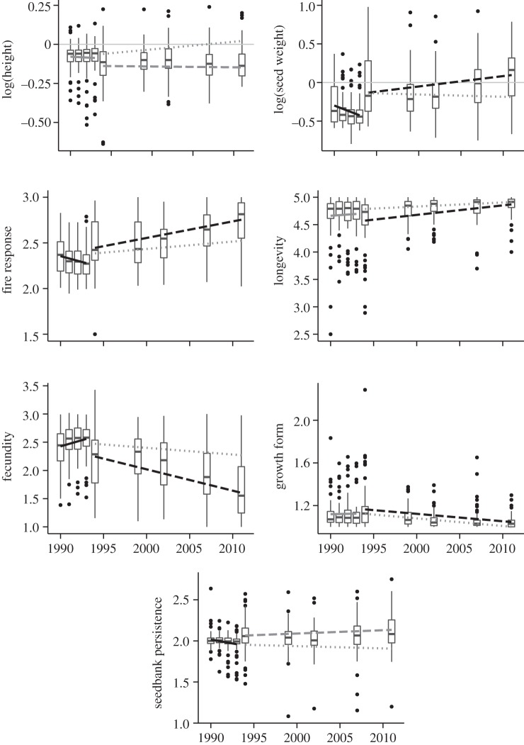
Figure 3.
Community-weighted mean-trait values through time. Trendlines correspond to models of individual traits versus time for all plots/sites through the first 4 years of sampling (solid line); plots/sites that only burnt in 1994 (dashed line) and plots that burnt in 1994 and 2001 (dotted lines). Trend lines shaded black indicate significant slope coefficients at p < 0.05; grey lines indicate insignificant slopes. Boxplot midline corresponds to median value for all 56 plots at each census point; upper and lower hinges give the first and third quartiles; whiskers extend from the hinge to the highest value that is within 1.5× interquartile range; and data points beyond whiskers are shown as outliers.

