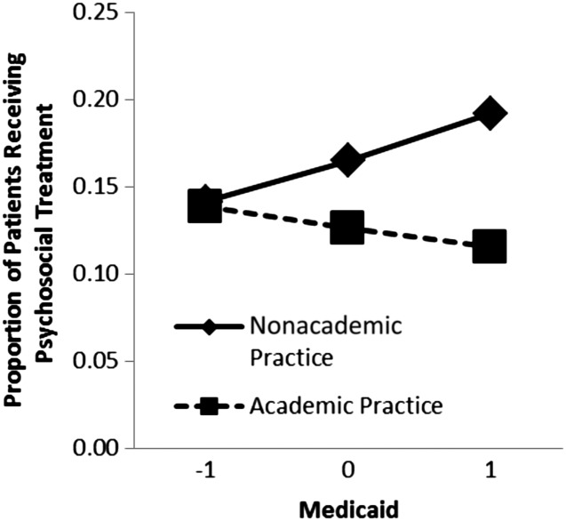
FIGURE 2.
Graphical depiction of significant interaction between proportion of patients receiving Medicaid and academic affiliation on rates of receiving psychosocial treatment. For purposes of illustration, the proportion of patients receiving Medicaid was centered to illustrate how practices with an average proportion of Medicaid patients (44.6%; coded 0 on the x-axis of graph) compares with practices with 1 SD fewer Medicaid patients (30.5%; coded −1 on x-axis of graph) and to practices with 1 SD more Medicaid patients (58.7%; coded 1 on x-axis of graph).

