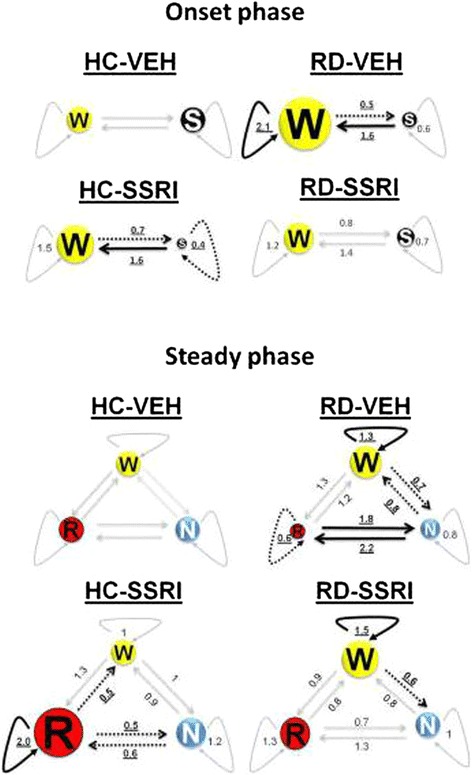
Figure 4.

Illustrations of Markov chains during the onset and steady phase. Numeric data represent the relative mean values of sojourn times and transition rates in the treatment groups compared to the mean values of the HC-VEH group (sojourn times and transition rates of the HC-VEH group are 1). The size of circles aligns the changes in sojourn times. Thick, uninterrupted arrows represent significant increase, dashed arrows show significant decrease and slight arrows sign no significant changes in transition speed compared to the HC-VEH group. Significant alterations are highlighted in bold, underlined characters.
