
Figure 4.
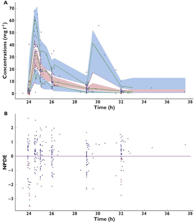
Visual predictive check (A) and normalized prediction distribution error (NPDE; B) vs. time since first dose for the final model. Visual predictive check details are as follows: the continuous green lines indicate the 10th, 50th and 90th percentiles for observed data; the shaded blue and pink areas represent 90% prediction intervals from the corresponding percentiles calculated from simulated data. Observations are plotted as blue circles and BQL data as red circles