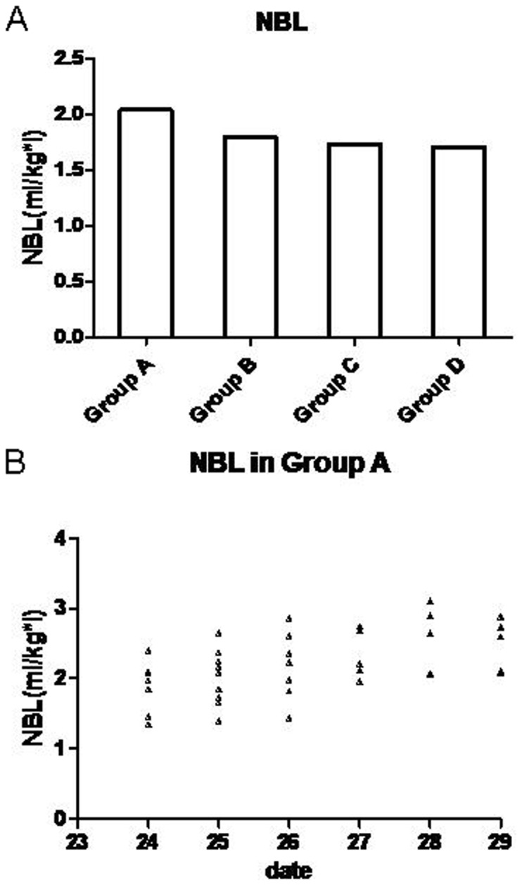
Figure 2. Average NBL between different groups and scatter diagram of NBL in group A.

NBL between groups (A) show NBL was significantly higher in group A than the other 3 groups, There was no difference between other 3 groups. Scatter diagram of NBL (B) in group A show the NBL has a tendency to increase during the last days of the menstrual cycle and achieve a peak during 1–2 days before Menstruation.
