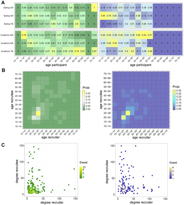
Figure 4. Who has contact with whom?
The green coloured plots on the left are all based on data collected in the Netherlands and purple coloured plots on the right on data collected in Thailand. Plots in (A) display for each age group the proportion of reported contact persons that were younger, the same age or older than the participants. Displayed values are proportions that were calculated separately for the categories “contact persons while eating” and “contact persons at different locations”. The brighter coloured cells indicate higher proportions. (B) The contact intensity matrices for recruiter-recruitees pairs with respect to age (displayed as proportions of country totals) and (C) degree (displays actual reported degree; outliers above 150 are not displayed). The brighter coloured cells/points in B-C illustrate higher contact recruitment rates and the darker cells/points lower rates.

