
Figure 1. Illustration of principal component analysis.
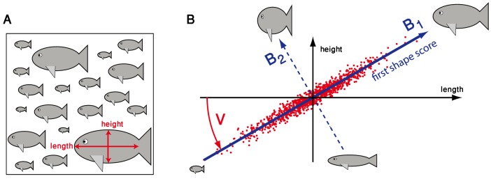
A. As a minimal example, we consider a hypothetical data set of length and height measurements for a collection of  individuals, i.e. there are just
  geometric features measured here. B. In this example, length and height are assumed to be strongly correlated, thus mimicking the partial redundancy of geometrical features commonly observed in real data. Principal component analysis now defines a change of coordinate system from the original (length,height)-axes (shown in a black) to a new set of axes (blue) that represent the principal axes of the feature-feature covariance matrix of the data. Briefly, the first new axis
  points in the direction of maximal data variability, while the second new axis
  points in the direction of minimal data variability. The change of coordinate system is indicated by a rotation
  around the center of the point cloud representing the data. By projecting the data on those axes that correspond to maximal feature-feature covariance, in this example the first axis, one can reduce the dimensionality of the data space, while retaining most of the variability of the data. In the context of morphology analysis, we will refer to these new axes as ‘shape modes’
  , which represent specific combinations of features. The new coordinates are referred to as ‘shape scores’
  .
.