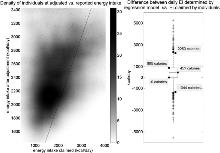
Figure 3.
Left: density of individuals according to adjusted EI vs. initial EIclaimed (energy intake claimed). Points represent data; darker regions indicate higher density of data points in that region. A line indicates unity. Most of the dense region lies above the line, indicating that most dietary intake was under-reported and shifted upward. A much less dense region below the line represents over-reporters. The majority of individuals claimed an intake in the range of 1,000–2,000 calories, and most of this group has been shifted to a range of about 1,900–2,400 calories. Another smaller group claimed between 2,000 and 2,500 calories and was shifted to around 2,700 calories. Dataset used includes only non-Blacks from National Health and Nutrition Examination Survey (NHANES) 2007–2008. Right: boxplot of calorie difference applied to individuals in the regression model. The interquartile range shows that most individuals under-reported and had EI (energy intake) adjusted upward. Some individuals still over-reported and had EI adjusted downward; however, the asymmetry of the box plot shows that many more individuals under-reported than over-reported. Outliers exist in both directions.

