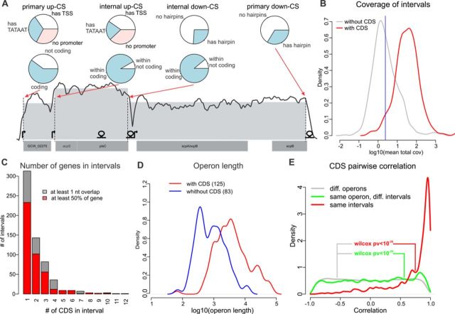
Figure 2.
SOT prediction. (A) Example of a predicted SOT. Annotated CDSs are shown at the bottom; the TSSs identified by 5′-ERS and the hairpins predicted by RNIE are shown above. The smoothed coverage (running mean in a 100 nt window; log scale) is shown with a solid line; the dashed vertical lines represent up- and down-CSs; and the mean interval coverage is represented by the gray area. Classifications of primary and internal CSs by TSS/hairpin existence and the coding potential of the SOT to which they belong are shown with pie charts. (B) Distribution of intervals with (red) and without (gray) CDSs by log coverage. The 5% quantile of the former is shown as a blue vertical line. (C) Distribution of intervals by the number of genes. (D) Distribution of SOTs with (red) and without (blue) CDSs by log length. (E) Distribution of Pearson's correlation coefficients for the pairs of genes that belong to the same interval (red), same SOT (but not interval, green) and genes from different SOTs (gray).

