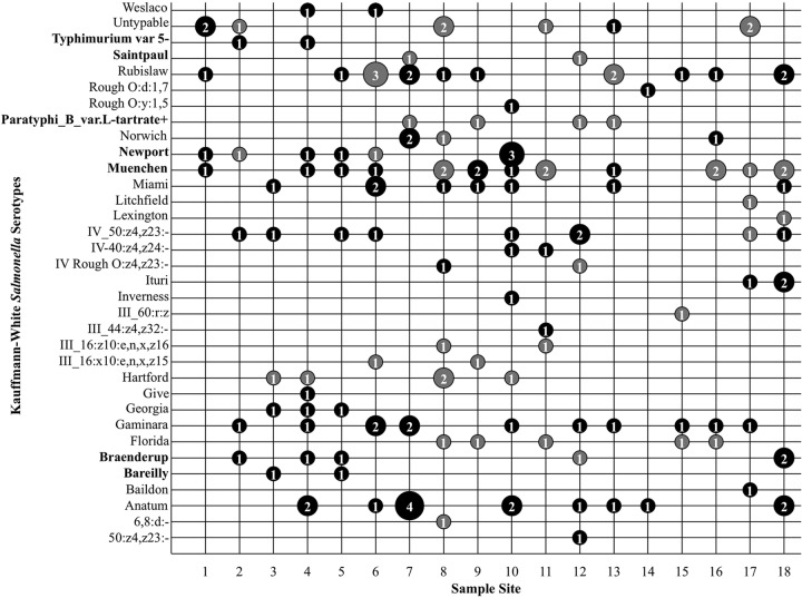
FIG 3.
Frequency of isolation of each serotype by location across all 12 sample times. For each combination of sampling site and serotype, the number of unique isolates collected across all sample dates is given inside a bubble, whose size is relative to that number. Black bubbles represent isolates in PFGE cluster A; gray bubbles represent isolates in all other PFGE clusters. Serotypes on the CDC's list of the 20 most common clinical serotypes are shown in boldface on the y axis.

