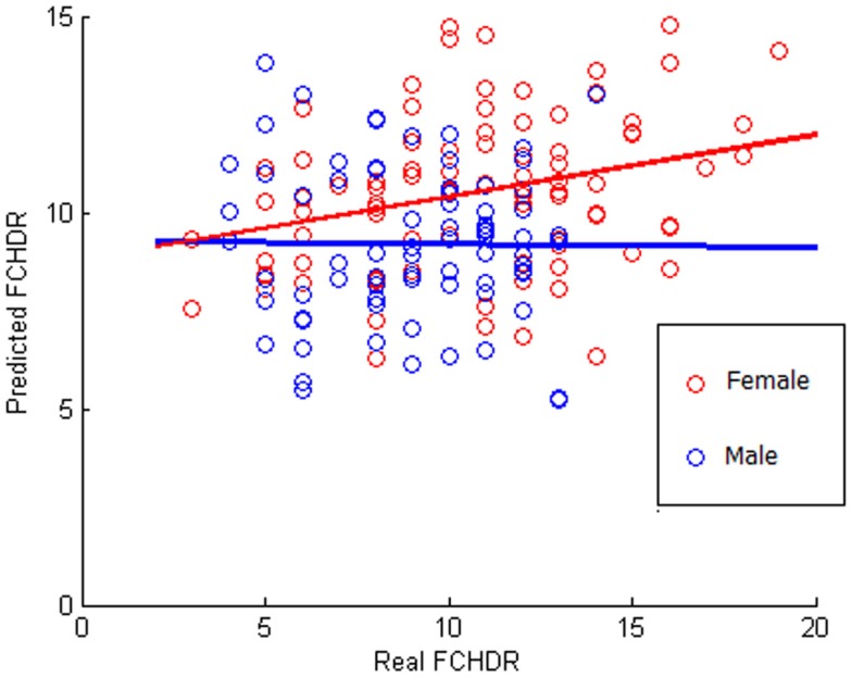
Figure 4.
Scatter plot of correlation between real and predicted FCHDR score codified in colors according to the gender. Please notice that this analysis was performed considering all subjects (male and female). The colors code (red for female and blue for male) was used in order to provide a better visualization regarding the gender difference observed in the results.

