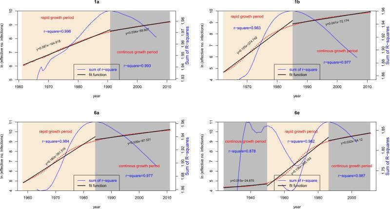
Figure 4.
HCV growth rates. Four simplified diagrams correspond to four BSPs. In each diagram, the median growth curve is shown in red, in which a dot represents a sampling time point. This curve is measured by the vertical ruler for population size on the left and the horizontal time scale on the bottom. The time course of HCV growth is divided into two periods: rapid growth (yellow area) and continuous growth (grey area). For different subtypes, the delimitation of these two periods is dissimilar. Based on the median population sizes exported from the four BSPs within these two periods, simple linear regression analyses were performed and the regression lines are shown separately and appear in each diagram with two discontinued black lines. Accordingly, two regression functions and two R squares are provided in each diagram, in which the slopes indicate the growth rates. In each diagram, a blue curve is also presented, reflecting the changes in the sum of R-squares generated after sliding two regression analyses through all sampling time points within a certain range. Measured by the vertical ruler on the right, this curve identifies the best time point at which the sum of R squares maximizes and two growth periods are thereby divided. Because the BSP for 6e has an additional period of constant population size prior to its rapid growth, three black and two blue curves are shown.

