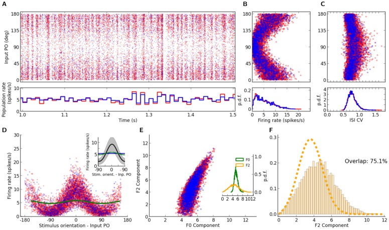
Figure 1. Distribution of orientation selectivity in networks with Erdős-Rényi random connectivity.
(A) Raster plot of network activity in response to stimulus with orientation  . Neurons are sorted according to their input preferred orientations,
  , indicated on the vertical axis. The histogram on the bottom shows the population firing rates, averaged in time bins of
  width. Here, and in all other figures, red and blue colors denote excitatory and inhibitory neurons, or neuronal populations, respectively. (B) Average firing rates, for all neurons in the network, estimated from the spike count over the whole stimulation period (
 ). The distribution of firing rates over the population is depicted in the histogram at the bottom. (C) Coefficient of Variation (CV) of the inter-spike intervals (ISI),
  , computed for all neurons in the network with more than
  spikes during the stimulation. The distribution of
  is plotted at the bottom. (D) Sample output tuning of
  excitatory and
  inhibitory neurons randomly chosen from the network, all aligned at their input preferred orientations. The input tuning (green, same as Eq. (4)) is normalized to the population average of the baseline (mean over all orientations) of output tuning curves. Inset: The mean (across population) of aligned output tunings are shown in black. The gray shading indicates
  extracted from the population. Linearly interpolated versions of individual tuning curves (generated at a resolution of
  ) have been used to compute
  and
and  of aligned tuning curves. The population average of the baseline (mean over all orientations) of output tuning curves is shown separately for excitatory and inhibitory populations with a red and a blue line, respectively (the lines highly overlap, since the average activity almost coincide for both populations). The normalized input tuning curve (green) is obtained by the same method as used for the main plot. (E) Scatter plot of F0 and F2 components, extracted from individual output tuning curves in the network. The individual distributions of F0 and F2 components over the population are plotted in the inset. (F) Distribution of single-neuron F2 components from a network simulation (histogram) compared with the prediction of our theory (dashed line, computed from Eq. (25)). To evaluate the goodness of match, the overlap of the empirical and predicted probability density functions (
 and
and  , respectively) is computed as
  . This returns an overlap index between
  and
and  , corresponding to no overlap and perfect match of distributions, respectively. Parameters of the network simulation are:
  ,
,  ,
,  ,
,  ,
,  ,
,  ,
,  .
.

