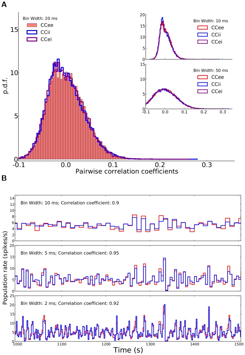
Figure 2. Correlations in the network.
(A) Distribution of correlation coefficients for pairs of neurons in the network. For the example network of Fig. 1, the distribution of Pearson correlation coefficients (CC) between spike trains of pairs of neurons is plotted.  excitatory and
  inhibitory neurons are randomly sampled from the network and all pairwise correlations (between pairs of excitatory,
  , between pairs of inhibitory,
  , and between excitatory and inhibitory,
  , samples), based on spike counts in bins of width
  are computed. The corresponding distributions for smaller (
 ) and larger (
 ) bins are shown in the inset (top and bottom, respectively). (B) The time series for the excitatory and inhibitory population spike counts indicate a fine balance on the population level. The correlation of activity between excitatory (red) and inhibitory (blue) populations is quite high on different time scales. The similarity of the temporal pattern of population activities is again quantified by the Pearson correlation coefficient.

