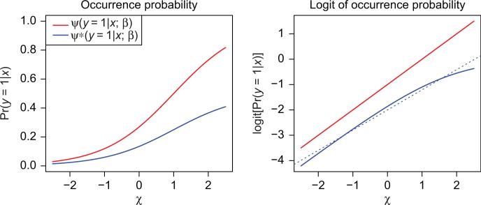
Figure 1.
Left panel: two different models for occurrence probabilities. The blue curve is half the red curve, and hence has exactly half the prevalence (marginal occurrence probability) of the red curve. The implied likelihood (Eq. 9) of the presence-data xi is identical for these two models. Right plot: the logits of the two models on the left. The broken blue curve is the best linear approximation to the solid blue curve – the approximation that would be imposed by a linear logistic regression model. Since the solid logit curves (red and blue) are indistinguishable with respect to the likelihood (Eq. 9), distinguishing the dotted blue line from the red is no easier than distinguishing it from the solid blue. Determining whether or not this slight curvature is present is the entire basis upon which the Royle et al. (2012) procedure would estimate the prevalence at either 34% (solid red) or 17% (dotted blue).

