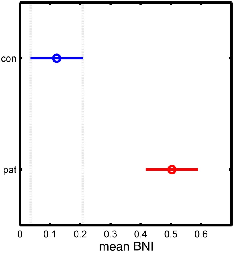
Figure 4.
Statistical analysis of the significant differences between control and patient groups based on the mean BNI measure. The y-axis separates the two groups, while the x-axis represents the mean BNI value. The horizontal line and the circle represent the variance and the mean value of BNI, respectively.

