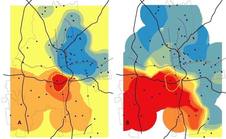
Figure 7.
Comparison of the density of black and white social networking application users in Atlanta. Panel A shows the absolute difference in users (Density of black users – Density of white users) color-coded so that areas with more black users appear red and those with more white users appear blue. Yellow regions are areas where the two densities are similar. Panel A highlights a small section of the city (the area shaded the darkest red) where there are many more black than white application users. Panel B shows a comparison of the relative size of the densities of black and white users (Density of black users/Density of white users). With this measure, Atlanta is divided nearly in half, with relatively more black users in the southwest and more white users to the north and east. The yellow band in Panel B shows the region with the highest absolute excess of black users for comparison purposes.

