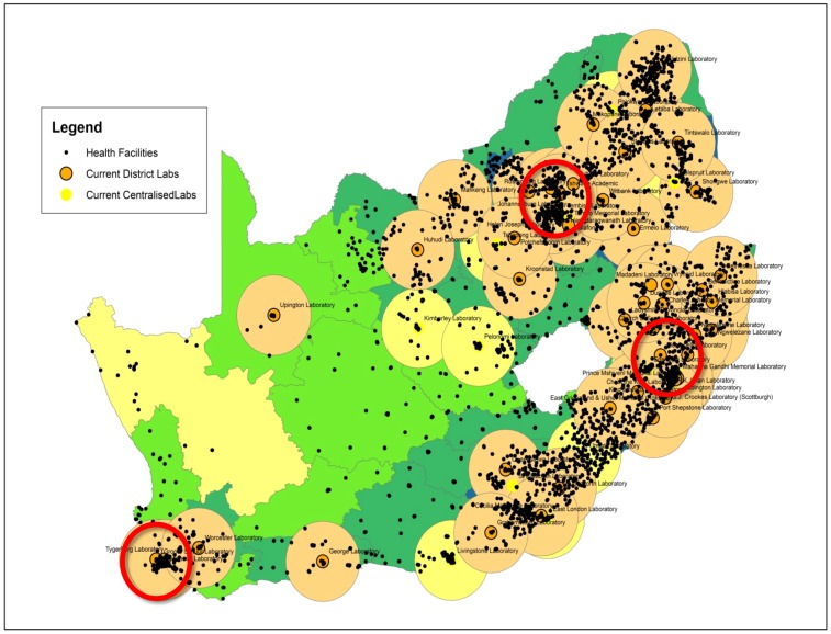
Figure 3. Current CD4 service coverage precincts.
Map to reveal current estimated service precincts based on an averaged 100 km Euclidian radius. Areas without drawn service precincts largely coincide with districts with poorer LTR-TAT (see insert Fig. 2). Note many health care facilities that fall outside of service precincts that would benefit from implementation of additional Tier-1, 2 and 3 services. Red circles highlight relatively over-subscribed areas with multiple ‘centralised’/metro laboratories in densely populated areas. In such metropolitan areas with high testing demands, amalgamation of services and the formation of a ‘super-laboratory’ could create critical mass, consolidate on technical skills and quality control provided that transport and IT logistics are absolutely optimized.

