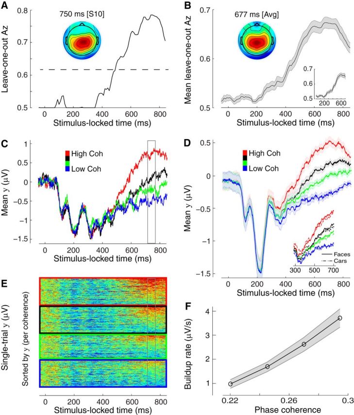
Figure 2.

Stimulus-locked discriminating activity. A, Classifier performance (Az) during high-vs-low sensory evidence discrimination of stimulus-locked data for a representative subject. The dashed line represents the subject-specific Az value leading to a significance level of p = 0.01, estimated using a bootstrap test. The scalp topography is associated with the discriminating component estimated at time of maximum discrimination. B, Mean classifier performance and scalp topography across subjects (N = 25). Shaded region represents SE across subjects. C, The temporal profile of the discriminating component activity averaged across trials (for the same participant as in A) for each level of sensory evidence, obtained by applying the subject-specific spatial projections estimated at the time of maximum discrimination (gray window) for an extended time window relative to the onset of the stimulus (−50 to 850 ms poststimulus). Note the gradual build-up of component activity, the slope of which is modulated by the amount of sensory evidence. D, The mean temporal profile of the discriminating component across subjects for each level of sensory evidence. Same convention as in C. Shaded region represents SE across subjects. Inset, Same data broken down by stimulus category (face and cars). E, Single-trial discriminant component maps for the same data shown in C. Each row in these maps represents discriminant component amplitudes, y(t), for a single trial across time. The panels, from top to bottom, are sorted by the amount of sensory evidence (high to low). We sorted the trials within each panel by the mean component amplitude (y) in the window of maximum discrimination (shown in gray). Note single-trial variability within each level of sensory evidence. F, The mean build-up rate of the accumulating activity across subjects was positively correlated with the amount of sensory evidence. Build-up rates were estimated by linear fits through the data based on subject-specific onset and peak accumulation times (see Materials and Methods). Shaded region represents SEs across subjects.
