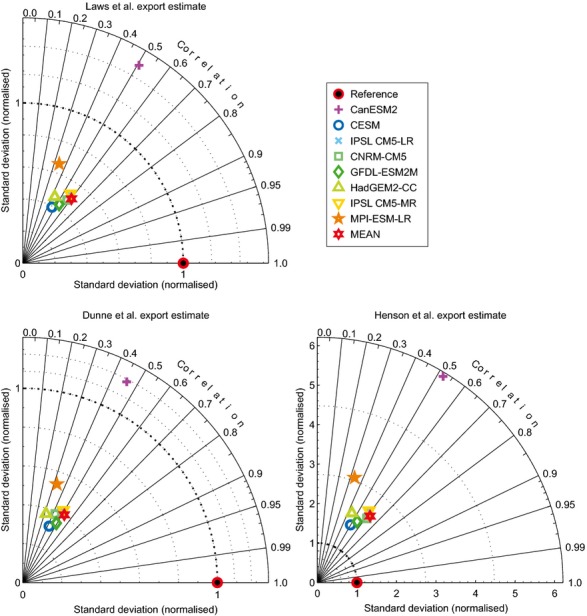
Figure 4.

Comparison of modelled data and satellite-derived estimates of export production. Taylor (2001) diagrams display the correlation (circumference axis) and relative variability (radial axis) between the actual data (EP100obs) and model estimates (EP100). Comparisons are made between modelled export production (Figure S6) and Laws et al. (2000); Dunne et al. (2007) and Henson et al. (2012). The mean represents a simple mean of the eight other models.
