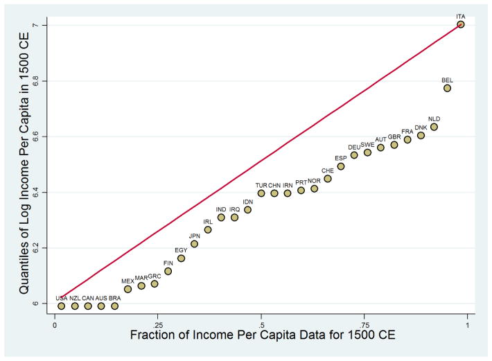
Figure D.3.
The Cross-Sectional Variability of Income per Capita in 1500 CE
Summary – This figure depicts the cross-sectional variability of Maddison’s (2003) income per capita estimates for the year 1500 CE. The x-axis plots the cumulative fraction of the data corresponding to each observation (in ascending order), and the y-axis plots the quantiles of the uniform distribution of log income per capita in 1500 CE. The closer the observations are to the 45-degree line, the more uniformly distributed is the data and, hence, the larger is the cross-sectional variability.

