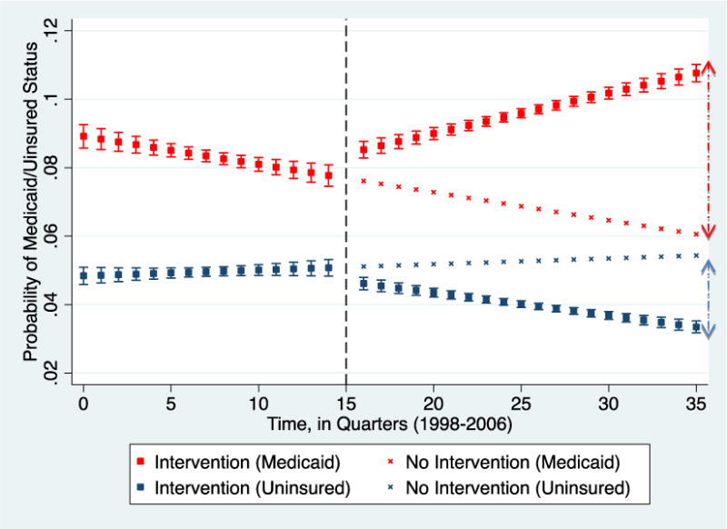
Figure 1. Quarterly probability of Medicaid beneficiaries and Uninsured patients receiving the selected musculoskeletal procedures.

Red/blue square plots: Observed proportion of Medicaid/Uninsured patients respectively, with the intervention.
Red/blue “x” plots: Expected proportion of Medicaid/Uninsured patients respectively if the intervention had not occurred.
Dashed line: Time of intervention.
At quarter 35 (roughly 5 years after the intervention), there were approximately 5% (red double arrow) more Medicaid patients treated than would have been if the intervention had not occurred. At the same time, there were approximately 2% less uninsured patients than would have been without the intervention (blue double arrow).
