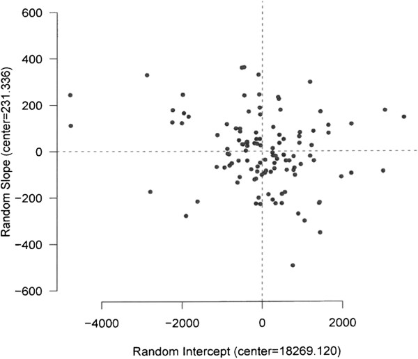
Figure 2.

A linear mixed-effects model for the general teaching hospitals. The analysis of general teaching hospitals’ performance is shown in Figure 1 (as an example) for the period of 2002 to 2005. The hospitals that are located in the first quadrant (top right), have a higher performance above the average at the baseline. They increased their performance with a higher rate than the average. Quadrant II (top left) represents the hospitals in which their performance was lower than the average performance in the reference year, but the average rate of increase was higher than the overall average. Quadrant III (bottom left) represents the hospitals in which their average performance and the rate of increase both were lower than the overall averages in the reference year. The hospitals in the fourth quadrant (bottom right) showed a higher performance and lower rate of increase than the overall averages.
