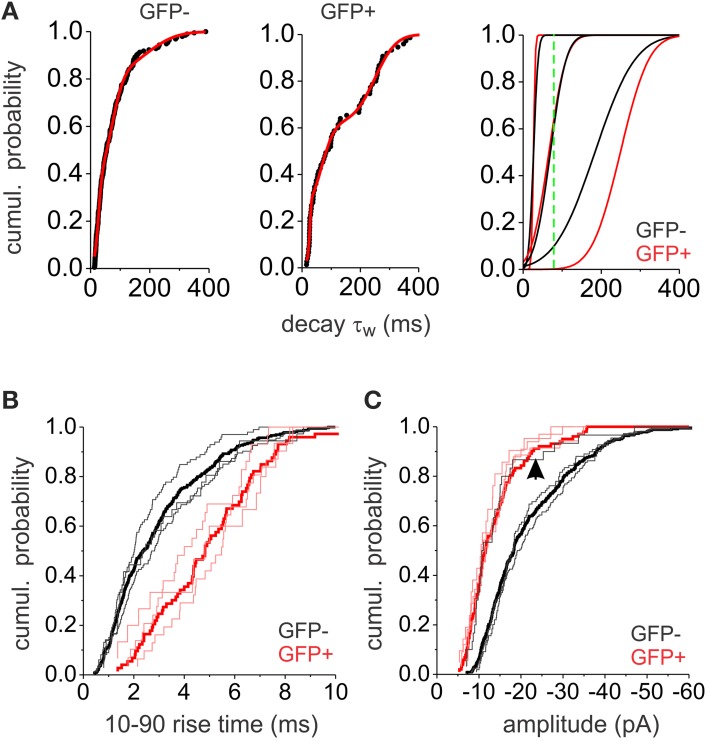
Figure 4.
Analysis of mIPSC populations. (A) The cumulative probability plots for GFP− and GFP+ neurons (left and middle) were fitted with the sum of three normal distribution functions (red line). The resulting three distributions are plotted (right) separately (black lines for GFP−, red lines for GFP+. The green line is showing the 100 ms cut-off point used to separate slower from faster events). (B) Cumulative probability plots of the 10–90% rise times for GFP− (black) and GFP+ (red) mIPSCs. Thick lines show the total mIPSC population while the thin lines show subpopulations of mIPSCs based on the three Gaussian distributions distinguished in (A). (C) Cumulative probability plots of the mIPSC amplitudes in GFP− (black) and GFP+ (red) interneurons. Thick lines show the total mIPSC population while the thin lines show subpopulations of mIPSCs based on the three Gaussian distributions distinguished in (A). The arrow denotes the cumulative distribution of the amplitudes in the slow decaying subpopulation of GFP− interneurons. All plots consist of pooled data from 6 GFP+ and 6 GFP− neurons. The same number of consecutively occurring mIPSCs from each cell was used.

