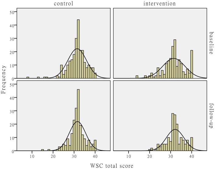
Figure 2. The distribution comparison of individual-level WSC total score.
Fig. 2 shows the distributions of individual-level WSC total score. The histograms and fitting normal distribution curves in the upper-left and lower-left corners in the figure represent the observation frequencies and distributions before and after the intervention in the control group. The histograms and fitting normal distribution curves in the upper-right and lower-right corners in the figure represent the observation frequencies and distributions before and after the intervention in the intervention group.

