
Figure 9.
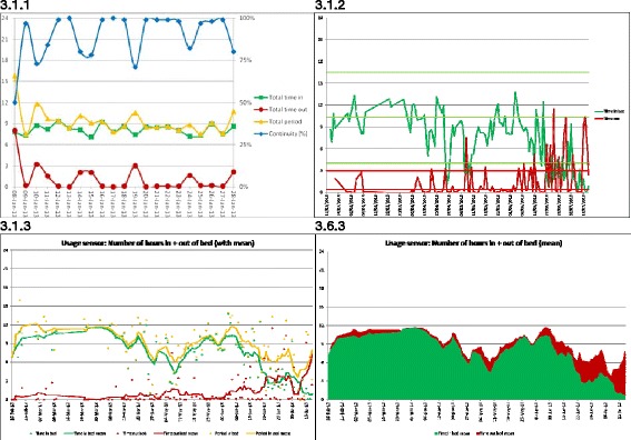
Visualization of usage sensor showing number of hours for each day 3.1.1: Number of hours features and continuity, where Total period (yellow line) is the sum of data for in (green line) and out (red line) of bed during the expected bed period; 3.1.2: Showing only time in (green line) and out of (red line) bed during expected bed period with normal pattern and deviation threshold lines; 3.1.3: Showing running average as solid line and actual data as points for total time (yellow line), time in (green line) and time out (red line); 3.6.3: Showing simplified stacked area graph of running average values.