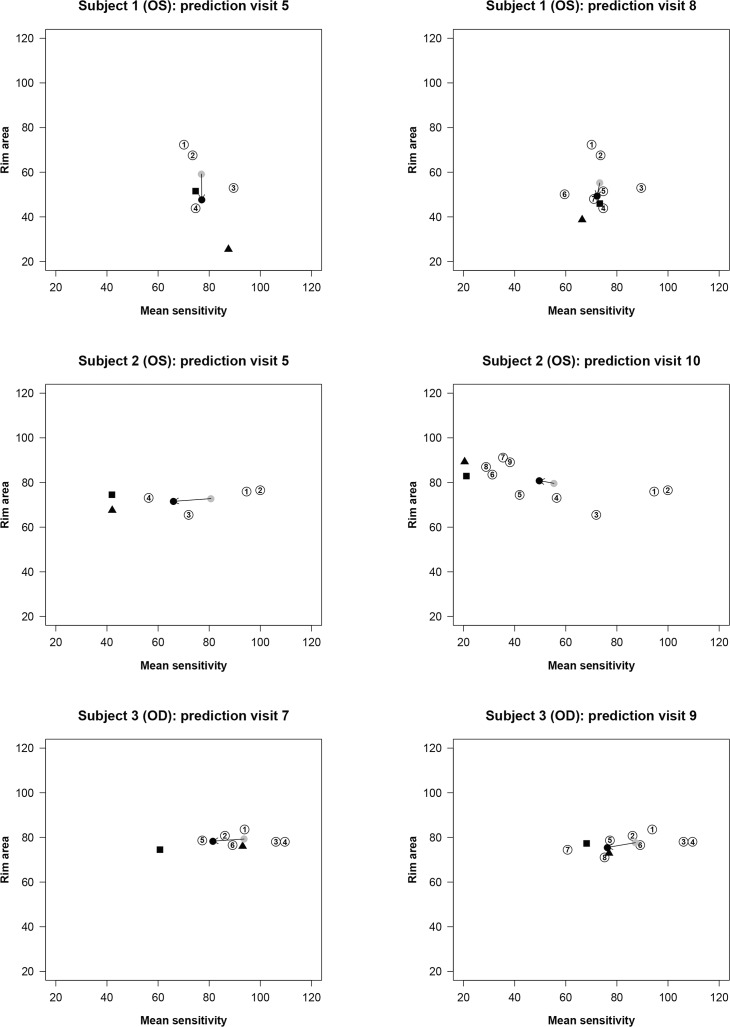
Figure 4.
Patient examples with the OLSLR and the DSF models based on series of RA and MS measurements. In each part of the figure, paired RA and MS data are plotted as circles coded with the numbers that identify the chronological order of the visits. The black triangle represents the predicted RA and MS measurements with the OLSLR model. The gray circle represents the latest centroid, and the black circle represents the predicted RA and MS measurements with the DSF model, respectively. The arrow shows the vector of change connecting the latest centroid and the predicted measurements in the DSF model. The predictions of the OLSLR and DSF models are compared with the actual RA and MS measurements at that future visit (black square).

