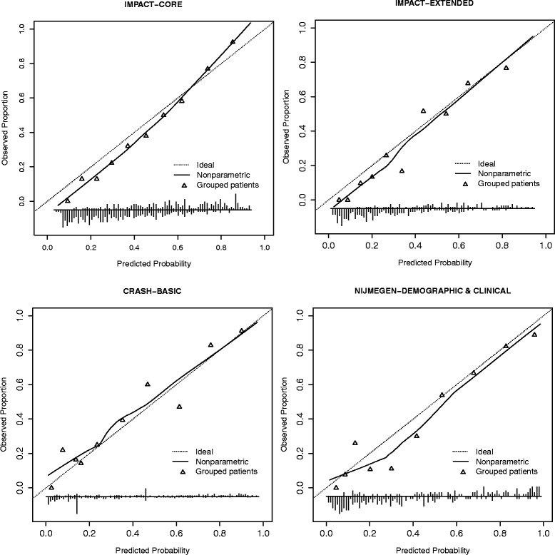
Figure 1.

Calibration plots for prognostic models predicting 6 month mortality. In the figures predicted probabilities of mortality or unfavourable outcome are plotted against actual observed proportions and this relationship is shown as a curve. The dotted diagonal line shows the optimal shape of the curve where the predicted and observed values match. The triangles show observed proportions by decile of predicted probability.
