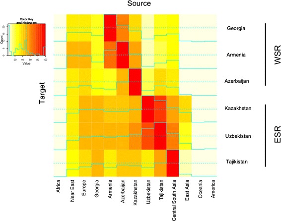
Figure 5.

Admixture between pairs of populations. Heat map showing admixture contributions of source populations to targets inferred from linkage disequilibrium patterns. Rows are the target populations, columns are the source populations. Admixture with the same population is set at 100% and coded in red. Full lines indicate exact values and dashed line mark the 50%.
