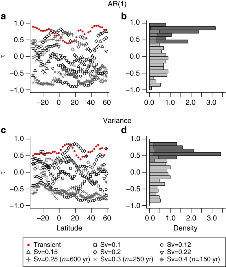
Figure 8. Comparing trends in early warning indicators from forced and equilibrium runs.
Histograms comparing Kendall’s τ values from the annual resolution transient run with those from the equilibrium runs, combining the results across all latitudes (see main text and Methods) for (a,b) AR(1) coefficient estimation and (c,d) variance indicators. (a,c) Results from the transient run are shown in red, from equilibrium runs where time series equal to transient run length (n=800 years) could be obtained are shown in black and from equilibrium runs where a tipping point occurred preventing a long enough time series are shown in grey. Results are summarized in vertical histograms (b,d) respectively. In both cases, the lighter histogram is composed of τ values from the equilibrium runs and the darker τ values from the transient run with the intermediate shading implying the histograms overlap.

