
Figure 3.
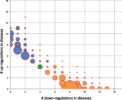
Up- versus downregulations. The balloon plot shows, for the different miRNAs, how many diseases the miRNAs are up- and respectively downregulated in. The bubble size represents the number of miRNAs showing this distribution in up- and downregulation. Orange bubbles belong to predominantly downregulated while blue bubbles belong to predominantly upregulated miRNAs. The two green bubbles represent 9 miRNAs that were equally up- and downregulated in disease.