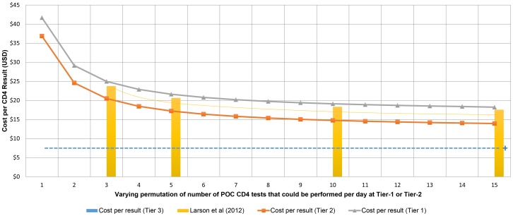
Figure 4. Costs per samples tested.
Cost-per-result based on number of samples run per day for Tiers 1 and 2 (line graphs), compared to published POC data [14] (actual reported points as light yellow bar graphs with extrapolated curve) versus baseline cost-per-result for Tier-3 (pale blue dotted line). The ‘+’ at the end of line represents higher capacity of workload of Tier-3 services.

