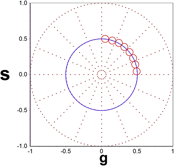
Figure 1.
Transformation of the autocorrelation function calculated from the short-time intensity acquisition to the phasor plot. The autocorrelation functions, after transformation to the phasor plot, appear along the blue circle in the first quadrant of the phasor (s against g) plot and appear in the areas shown by the red cursors (circles). Slow diffusion appears at large phase angles and fast diffusion at smaller phase angles. To see this figure in color, go online.

