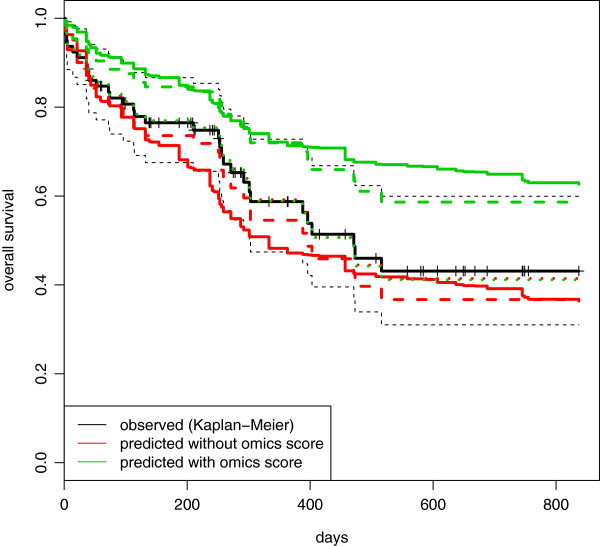
Figure 7.

AML: comparison between observed and average predicted survival curves in the validation set. Acute myeloid leukemia: comparison between the observed survival curve (Kaplan-Meier, black line) and the average predictive survival curves computed in the validation set using the clinical (red line) and combined (green line) models fitted on the training data. Continuous lines represent the average predictive survival curves computed interpolating the baseline survival curve derived in the training set. Dashed lines represent the same curves computed using an estimation of the baseline survival curve derived in the validation set. For the dotted curves, the estimates of the regression coefficients are shrunk toward 0.
