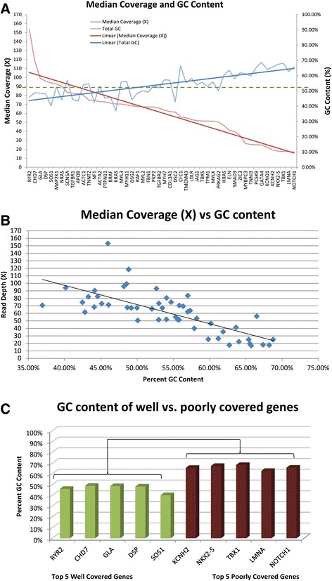
Figure 5.

GC content analysis. A. GC content (blue) and median coverage (red) for each of the 50 cardiac genes was plotted in decreasing order of from highest to lowest coverage. The linear average was plotted as the dark line in blue for GC content and red for median coverage. These linear averages show that as median coverage decreased from left to right, GC content increased. B. For each of the 50 genes, the median coverage and GC content percentage was plotted. There was a negative correlation between median coverage and total GC content of the 50 cardiac genes (r2 = 0.547; p = 8.66 × 10⁻¹⁰). C. Percent GC content of the top five well covered genes in green and the bottom five poorly covered genes in red showed a significant difference (p = 1.48 × 10⁻⁵).
