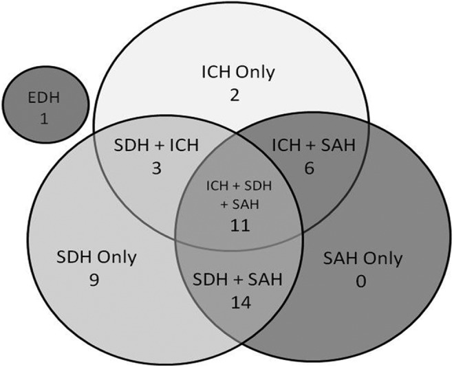
FIG. 2.

Venn diagram of relative distribution of CT findings (location/etiology) in the hematoma population. Numbers shown are the percentage of the total hematoma population. The small gray circle represents the one epidural hematoma (EDH) in this population. ICH, intracerebral hematoma; SAH, subarachnoid hemorrhage; SDH, subdural hematoma.
