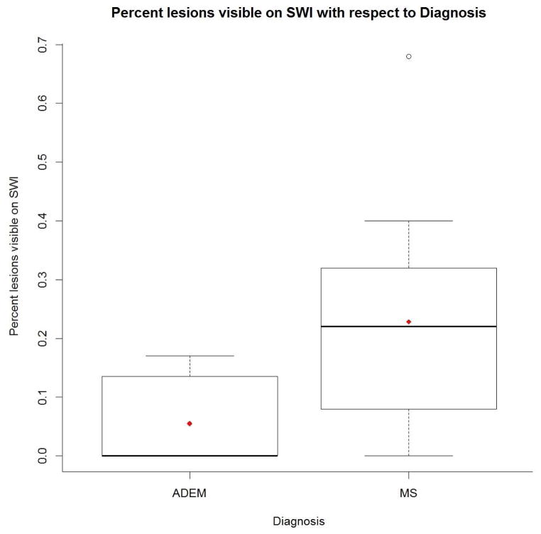
Fig 3.
Boxplot showing differences in percentage of FLAIR lesions visible on SWI between ADEM and multiple sclerosis patients. In each group, the top bar represents the maximum value, the top edge of the box the 75th percentile, the diamond the mean, and the bolded line the median. In the ADEM group, the median, minimum, and 25th percentile are all zero. In the multiple sclerosis group, the bottom edge of the box is the 25th percentile, the bottom bar is the minimum, and the circle is an outlier.

