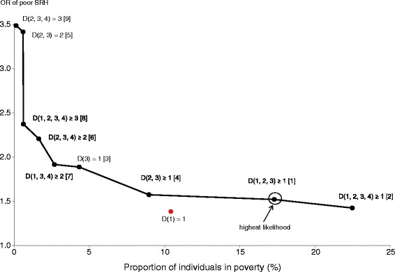
Figure 2.

The effective poverty curve for poor self-rated health (SRH). Dots on the line indicate a combination of the proportion of individuals in poverty and the odds ratio (OR) of poor SRH for each effective type of poverty. Figures in brackets indicate the ranking order of likelihood of predicting poor SRH.
