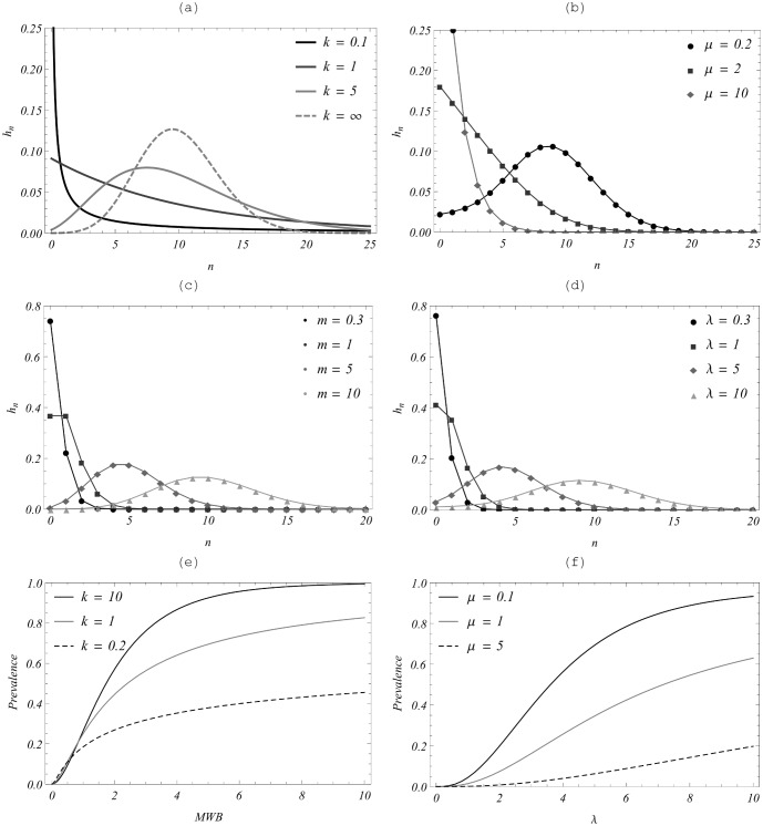
Figure 2. Comparison of worm distribution patterns for a negative binomial-based MWB system vs. a SWB system.
Here, all SWB distributions (right-hand panels) are produced from an uninfected source  . (a) NB-MWB with fixed mean
  and increasing k (
 is the limiting Poisson case); (b) Equilibrium SWB distribution for uninfected source with FOI (mean)
  , and varying demographic parameter
  (see equation (13));
  plays the role of aggregation k for NB, with small
  corresponding to large (infinite) k. Panels (c−d) Poisson distributions with different means,
  (left panel) vs. SWB distributions with different
  (right panel) exhibit striking similarity. Panels (e)−(f) compare infectious prevalence
  for the two models as a function of NB-MWB w or SWB
  .
.

