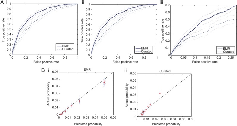
Figure 3.
(A) Receiver operating characteristic (ROC) curves for the first 2 models listed in Table 3. The thin dotted lines represent the 95% confidence bounds generated using 100 bootstrap samples from the test data. A(i) shows the ROC curve generated on all admissions in the test data, whereas A(ii) considers only those patients with a risk period of at least 48 hours. A(iii) focuses on only a portion of the ROC curve presented in 3A(ii). (B) B(i) shows the calibration for the EMR model, and B(ii) shows the calibration for the Curated model. The black dashed lines represent perfect calibration, ie, where the predicted probability aligns with the likelihoods seen when the classifier is applied to the test patients (45 degree line).

