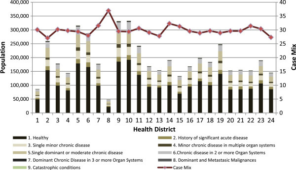
Figure 2.

CRG core health status by health district and case mix 2012. Shows a stacked column chart, comparing the contribution of each value to a total across categories of CRGs core health statuses for each health districts. The x axis of the chart shows the health districts compared and the y axis represent a double scale with the case mix on the right and the n° of patient grouped by CRG core health status on the left.
