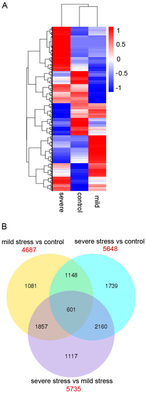
Figure 6. Cluster analysis of the DEGs across three comparisons.

A. The differentially expression levels were log10 transformed and are shown with high expression represented by red and low expression represented by blue. B. Venn diagrams showing DEGs across three comparisons (mild stress versus control; severe stress versus control; and severe stress versus mild stress). The red values correspond to the total number of DEGs in each comparison; the overlapping values correspond to the number of differentially expressed genes in two/three comparisons.
