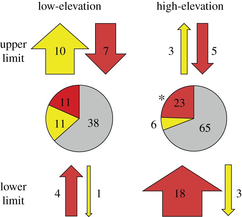
Figure 3.

Number and proportion of upper and lower range shifts of high- and low-elevation species across all regions. Pie charts display the proportions of range limits that exhibited significant expansions (yellow), contractions (red), or no significant change (grey). Numbers represent the number of individual shifts observed in each category. An asterisk next to a pie indicates that significantly more contractions were observed than expansions. For each elevation and limit category, the arrows above and below each pie indicate the direction (up or down) and the number of shifts observed in each direction at each range limit, with the width of the arrow indicating the relative proportion observed within each category. The colours of arrows indicate whether the shift resulted in an expansion (yellow) or contraction (red).
