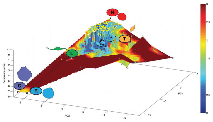
Figure 3.
A morphological landscape for Drosophila Kc hemocytes. We have previously described the average quantitative morphological signature (QMS) of cellular populations following depletion of 282 different genes and two control populations [23]. Here, the average QMS of each cell population is represented by a node in a 3D space, where the x and y coordinates represent the first two principal components (PCs) of the QMS vector, and the z-axis is the z-score for penetrance. The z-axis has a reversed direction as smaller numbers are on top, thus a population of completely rounded (or “normal”) cells would be at the peak of the landscape; and populations enriched with mutant phenotypes are located in broad “high valleys”. The color of each node corresponding to the cluster assignment defined in Yin et al. [23], and the surface connecting all the nodes are fitted using linear interpolation, and for each point within the surface, the sum of the distance to three nearest nodes is quantified as the color of the point. Blue coloring indicates that the nodes are in close proximity to each other, whereas increasing levels of red shading indicates increasing distance to any other node in PC space. A cutoff was applied to the distance/color measurements to preserve the detailed geographical information close to the peak of the landscape.

