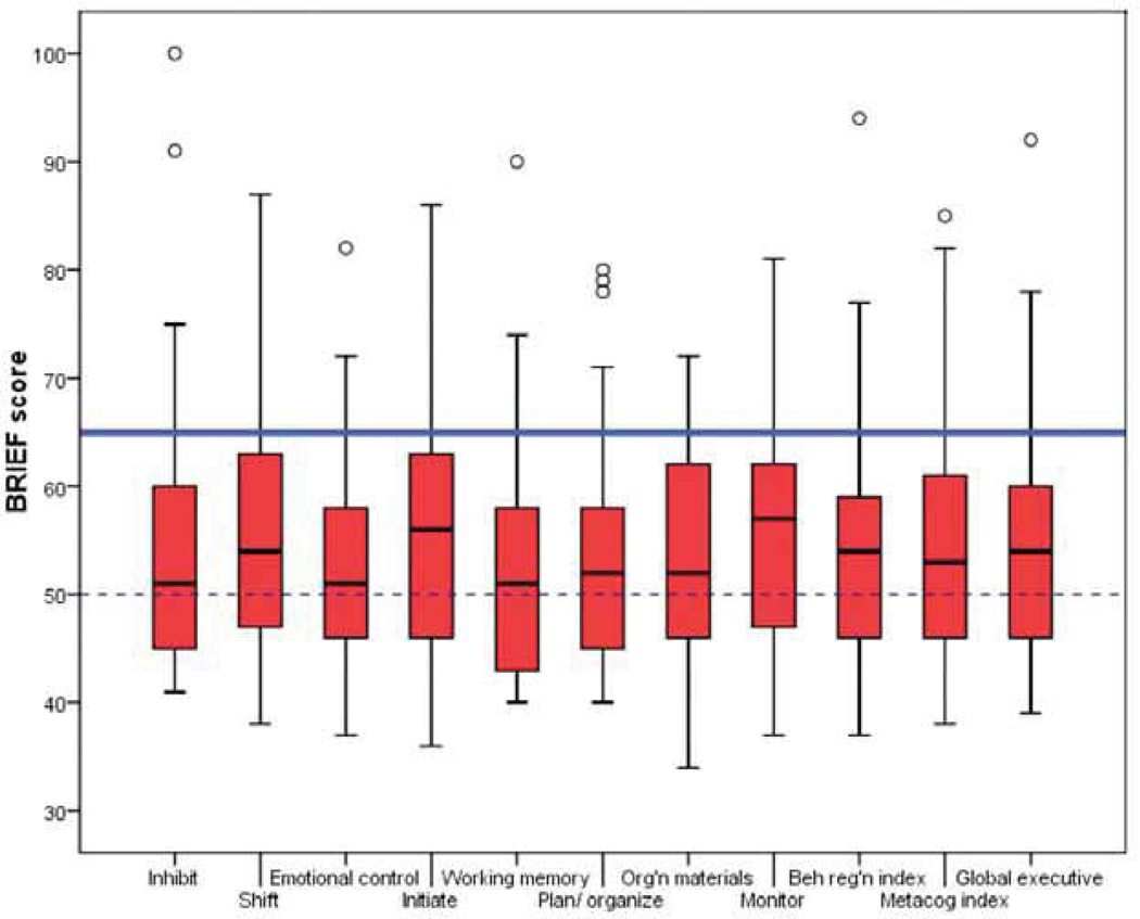
Figure 1.
Distribution of scores in BRIEF. This box plot is a summary of the distribution of children’s t-scores on the eight domains and three indexes of the BRIEF. The top of each red box represents the 75th percentile, the bottom of the box represents the 25th percentile, and the line in the middle of the box is the median. The whiskers represent the highest and lowest BRIEF t-scores that are not extreme scores; extreme scores are represented by the circles. The dashed line represents the average expected score (t-score = 50) and the solid line represents the clinically significant range (t-score = 65 or higher).

