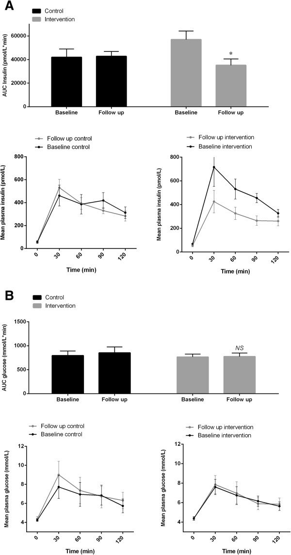
Figure 2.

The glucose metabolism measured by oral glucose tolerance test. The area under curve is shown as bar graphs, while the response over time is shown as curves for plasma insulin (A) and glucose (B), respectively. P values are representing the intervention effects (the difference in change between the groups) adjusted for the respective baseline values (95% confidence intervals as error bars on bar graphs and Standard Error of the Mean as error bars on curves). ★, P <0.05; ns, not significant.
