
Fig. 1.
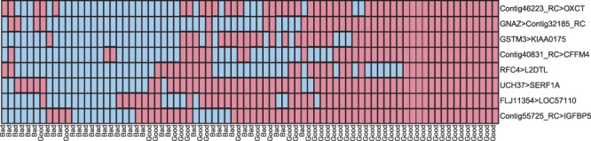
The comparisons votes (y-axis) versus samples (x-axis). The samples are labeled either good prognosis or bad prognosis for breast cancer. Truth and falsehood of the comparisons are indicated by blue (lighter shade) and red (darker shade), respectively. The combination of the votes can be used to classify, illustrated by requiring at least three votes for declaring bad prognosis. More explanation and code for this figure can be found in the Supplementary Document