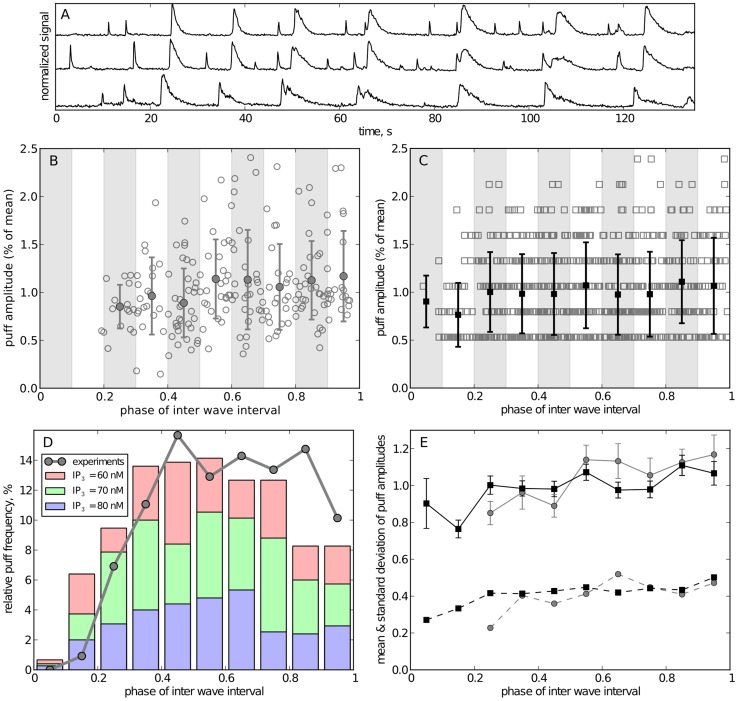
Figure 8. Comparison of inter-wave dynamics for experiments and simulations.
(A) shows representative fluorescence traces from 3 puff sites in Xenopus oocyte. Waves were identified as large signals that occurred approximately at the same time at all cluster sites. (B, C): scatter plot of puff amplitudes in experimental (B) and simulated traces (C). The amplitude of a puff is defined by the peak fluorescense for experimental data and the peak number of open channels for simulated data. The horizontal axis is the inter-wave phase with 0 corresponding to the time of the preceding wave and 1 corresponding to the time of the next wave. Experimental data was pooled from four experiments, simulation data was pooled from traces for 60, 70, and 80 nM [IP3]. The amplitudes of experimental and simulated data were then rescaled to their respective mean amplitude. The data was grouped into 10 intervals (shaded regions); filled markers and error bars denote the mean and standard deviation of each group, respectively. (D) Temporal distribution of puff frequency between two waves after binning of data in 0.1 phases. (E) Mean (solid lines with standard error) and standard deviations (dashed lines) of binned amplitudes for simulations (black) and exeriments (gray).

