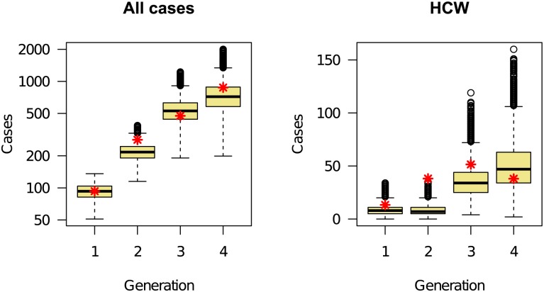
Figure 4. Comparison between the total number of reported cases (aggregated data from Table 2, red asterisks) and model-generated distribution (box-and-whisker plots) during four generations of the epidemic, starting 4 July 2014.
Shown are values for all cases (left panel) and cases among HCWs (right panel). The underlying data and code to generate this figure may be obtained by running the file “ebola-forecasting-main-text.R” deposited in the Dryad repository: http://doi.org/10.5061/dryad.17m5q.

